Bad mobile formatting with TouchKit 5 #17
Description
I'm in the process of porting a Vaadin7/TouchKit4 application to Vaadin8/TouchKit5.
I'm at the stage where the application looks similar to the Vaadin7/TouchKit4 version when displaying in a regular web browser on a PC.
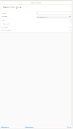
However, on a mobile device, the formatting is all squashed up (the font is way too small, for one thing).
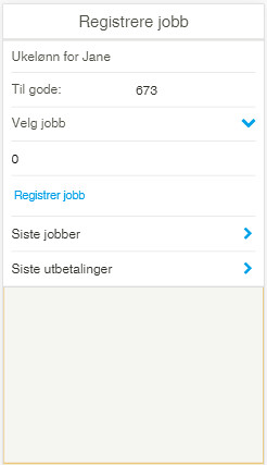
The Vaadin7/TouchKit4 version looks like this (this is what it's supposed to look like):
The Vaadin8/TouchKit5 version looks like this:
What might cause this layout difference? And why do I see it only on mobile devices?
The Vaadin7/TouchKit4 version of the code:
https://github.com/steinarb/ukelonn/blob/master/ukelonn.bundle/src/main/java/no/priv/bang/ukelonn/impl/UkelonnUI.java#L30
https://github.com/steinarb/ukelonn/blob/master/ukelonn.bundle/src/main/java/no/priv/bang/ukelonn/impl/UserView.java#L43
The Vaadin8/TouchKit5 version of the code:
https://github.com/steinarb/ukelonn/blob/work/using-vaadin-with-vaadin8/ukelonn.bundle/src/main/java/no/priv/bang/ukelonn/impl/UkelonnUI.java#L29
https://github.com/steinarb/ukelonn/blob/work/using-vaadin-with-vaadin8/ukelonn.bundle/src/main/java/no/priv/bang/ukelonn/impl/UserView.java#L46
I've used chrome development tools simulating an iPhone 5 to make the screen captures, but it is similar to what I see on real mobile devices.